Birthing Culture
Maternity education built as a brand, not a pamphlet.
The Brief
Birthing Culture teaches birth education to expecting parents, and the teaching was never the weak link. Reach was. Everything that made the work worth booking, the calm in the room and the answers to the questions people are too embarrassed to ask out loud, lived inside sessions with parents who had already found their way to the founder. Nobody outside that room saw any of it. The register is the harder problem. Birth is a sensitive thing to teach around, and the presentation has to hold warmth and authority in the same frame. Lean warm and it stops sounding like expertise. Lean authoritative and it starts sounding like a hospital corridor. The Mother-and-Child Heart emblem was the mark to build from, and it was the right one. What did not exist yet was the system around it: the type, the photography, the site, the weekly video, the rhythm that keeps all of it moving.
What We Built
- Brand system
- 3D website build
- Weekly 4K video production
- Social content engine
- Brand system built around the Mother-and-Child Heart emblem, covering type, colour and photography direction.
- 3D website build, serif display hero set over interior photography.
- Hero line locked as I MET MY STRENGTH THE DAY I GAVE BIRTH.
- Motion rules written for pacing and applied across every section of the site.
- Weekly 4K video production, founder to camera.
- Social content engine that draws each week's posts from that week's shoot.
How It Runs
The identity had to carry a subject that can frighten people and stay calm while it does it. So the emblem does all the emotional signalling, the Mother-and-Child Heart holding the warmth on its own, and everything around it stays plain. Warm neutrals rather than anything bright, and a serif rather than a geometric sans, because a serif reads as a person talking and a sans reads as a service. Nothing in the system raises its voice, and nothing in it goes soft either.
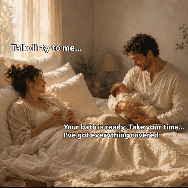
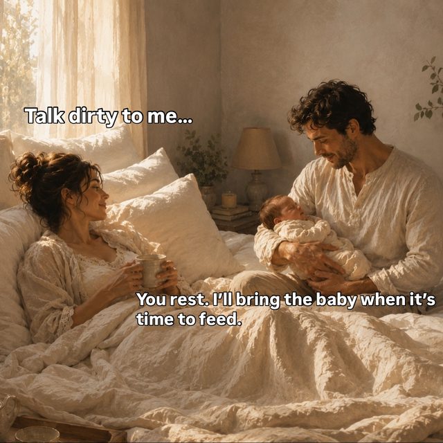
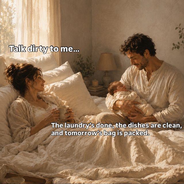
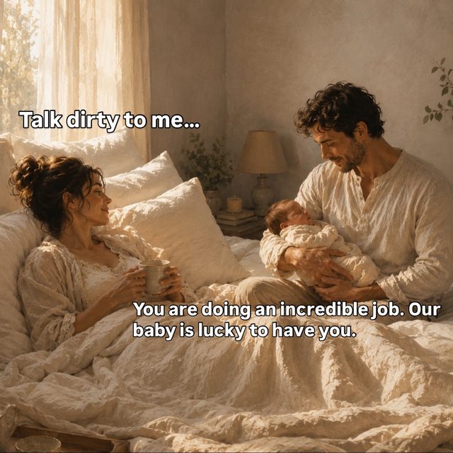
The site opens on a line in the first person: I MET MY STRENGTH THE DAY I GAVE BIRTH. That was a deliberate refusal to lead with a description of the service. Set in a serif display face at full width, over warm golden interior photography, it puts a parent's own sentence in front of a parent before anything is asked of them. The photography matters more than it looks. Rooms with warm light read as somewhere you would actually sit down, and that is the promise the education is making.
Building the site in 3D on this subject sounds like the wrong instinct, and it would be if the motion behaved the way motion usually behaves. We ran it the other way and used depth to slow the page down. Scroll moves through layers at a pace closer to breathing than to a product launch, so the reader arrives at each section rather than being thrown at it. The technical work went into restraint. Nothing snaps or jumps into frame, and every transition had to survive being watched by someone who is already nervous.
Weekly 4K video is the part of the engagement that does the actual teaching. The founder's expertise had been reaching the parents who booked and nobody else, so we built a production line that puts it to camera every week and treats it as the product rather than as promotion for the product. Shooting at 4K is not vanity. It gives the edit room to reframe a single take into vertical and horizontal cuts without the picture falling apart, which is what makes a weekly cadence survivable instead of a monthly scramble.
The social engine hangs off that weekly shoot instead of running as a separate content brief. One session of teaching becomes the long piece, the short vertical cuts, and the written posts that carry the same idea in text for parents who read rather than watch. That structure is why the calendar holds. There is no week where somebody has to invent a topic, because the topic is whatever the founder taught on camera, and the brand system means every cut out of that session already looks like it belongs.
Where It Landed
- Birthing Culture now has a brand system rather than a set of files. The emblem, the type, the photography direction and the motion rules all resolve to the same calm register, so anything made next already knows what it is supposed to look like.
- The teaching leaves the room. Weekly video puts the founder's expertise in front of parents who were never going to find their way to a class, and it arrives at a quality that matches the seriousness of what is being taught.
- The site reads as a brand a parent can trust with a sensitive decision, because it opens on a parent's own words rather than a service description, and it holds that warmth without ever sounding vague about what is being taught.
- The content operation is repeatable. Each week's shoot feeds the long piece, the cuts and the written posts, so output no longer depends on anyone finding a new idea on a Monday morning.