K2O
by Kylie Jenner
A drinks launch that had to hold up on day one.
The content.
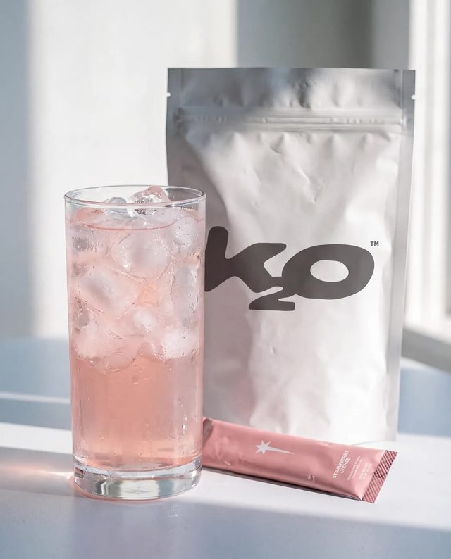
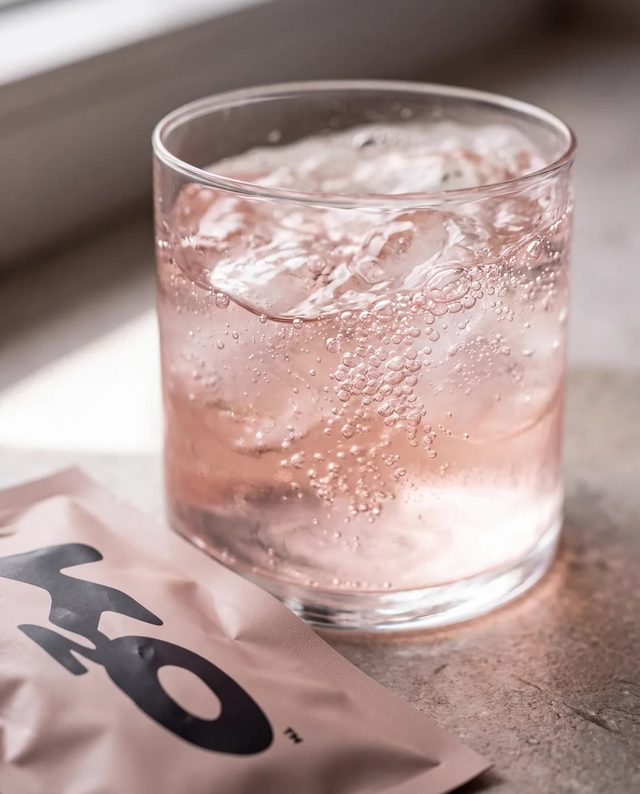
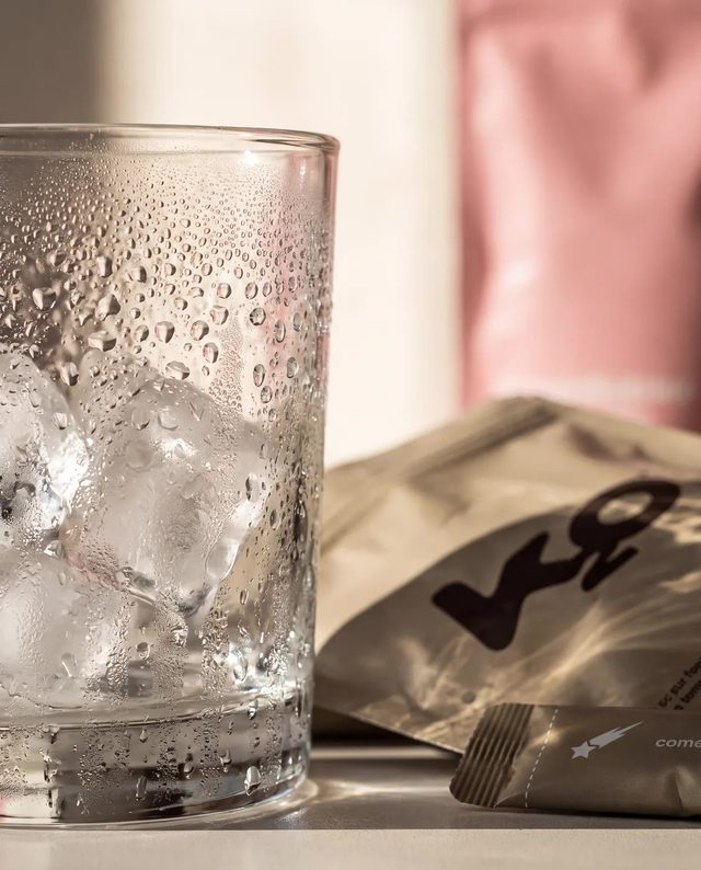
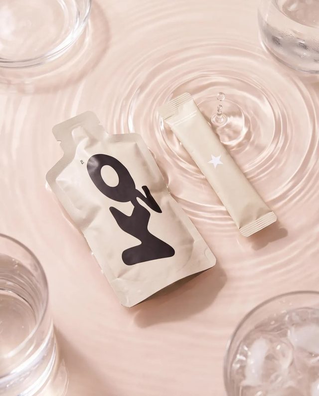
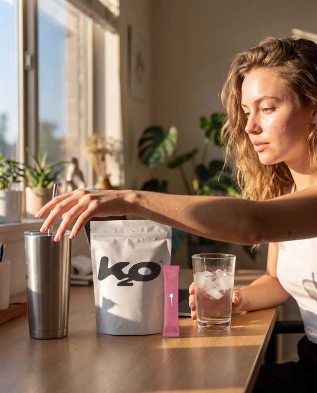
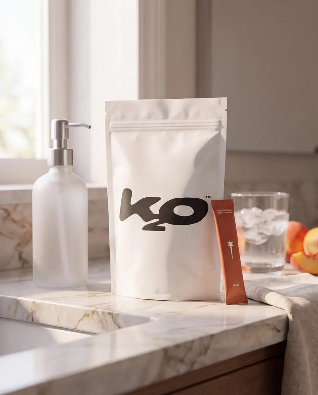
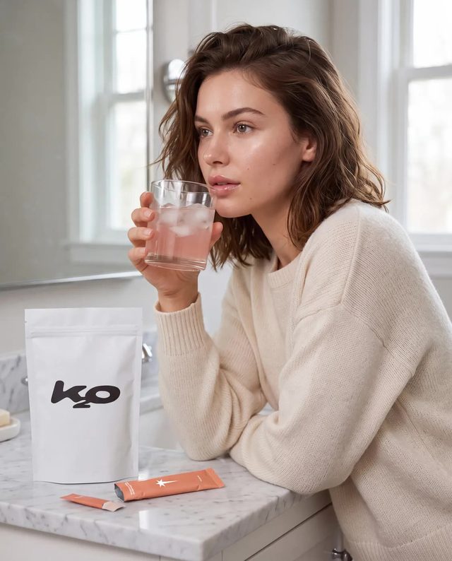
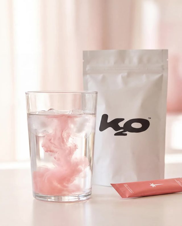
Work delivered for the client.
The Brief
K2O launched with a date locked and a name on the box that guaranteed attention. Attention was never the problem. The drink is an electrolyte and collagen hydration sachet sold direct to consumer, so every unit moves through a page rather than off a shelf, and on day one that page did not exist. A launch attached to a very large personality gets one first impression, and whatever the audience finds when they arrive is what they judge the brand on, with no quiet week afterwards to fix it. What existed was the product and the date. What did not exist was the thing that turns a post into a purchase: a page that explains the format in a sentence and takes payment without asking anyone to think about it. That was the gap.
What We Built
- Shopify landing page build
- Launch creative and product imagery
- Shopify landing page built as a single purchase path, live at drinksprinter.com.
- Hero copy written for the page: "built for beauty" and "hydration for how you actually live".
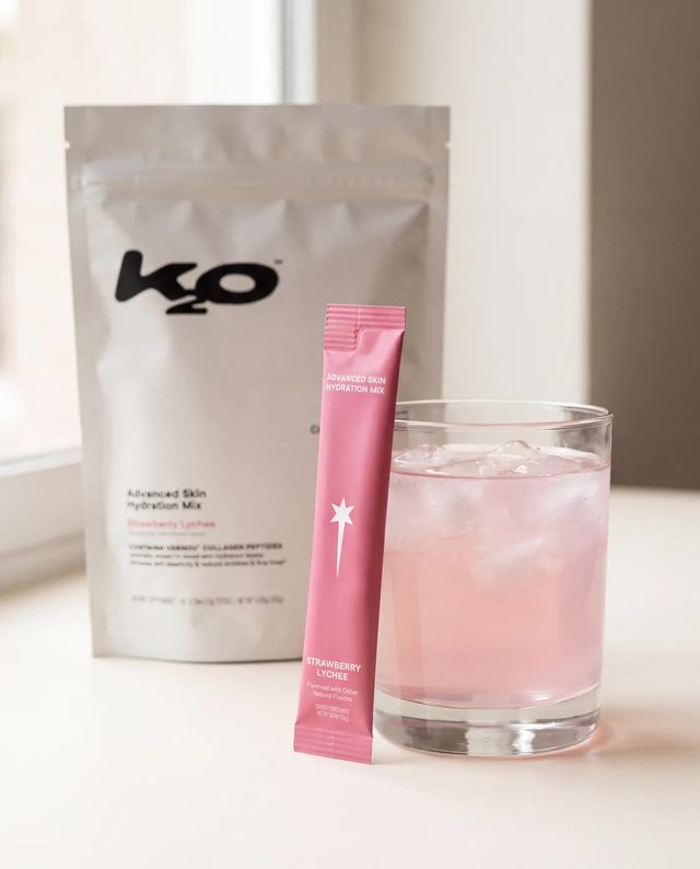
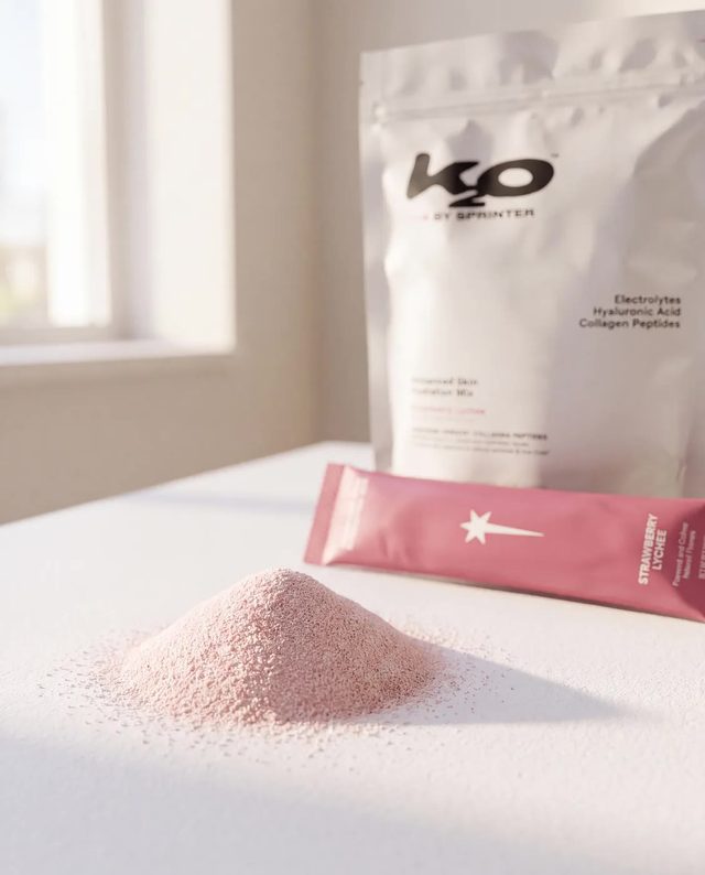
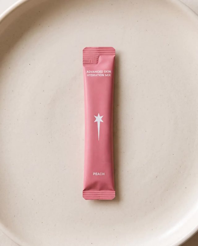
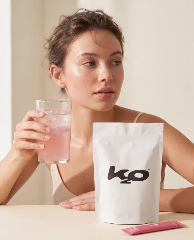
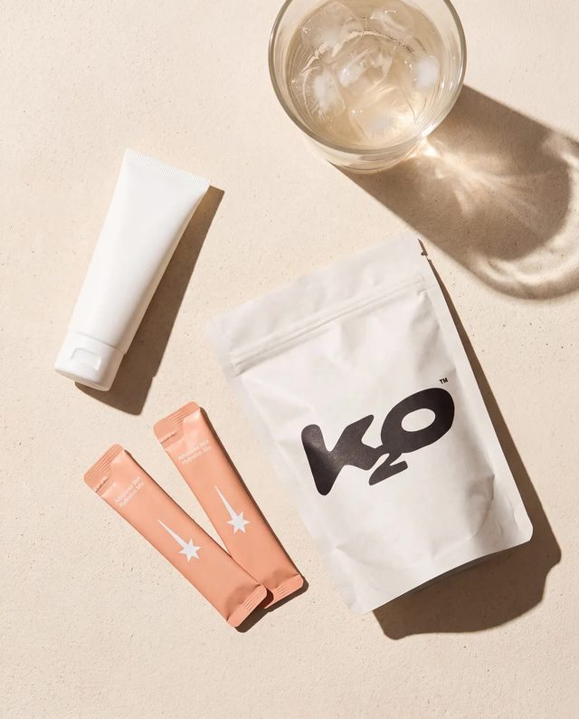
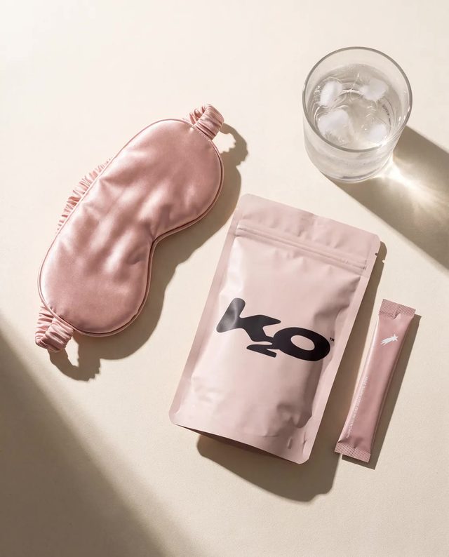
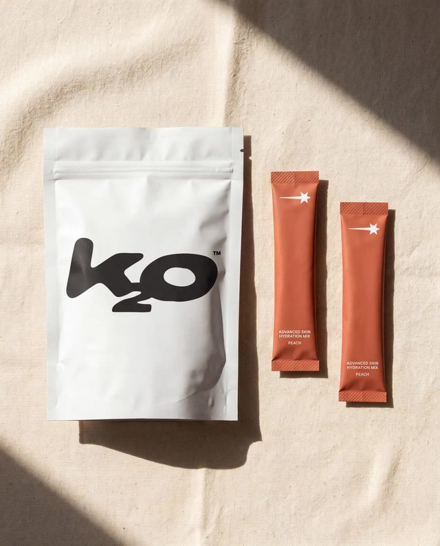
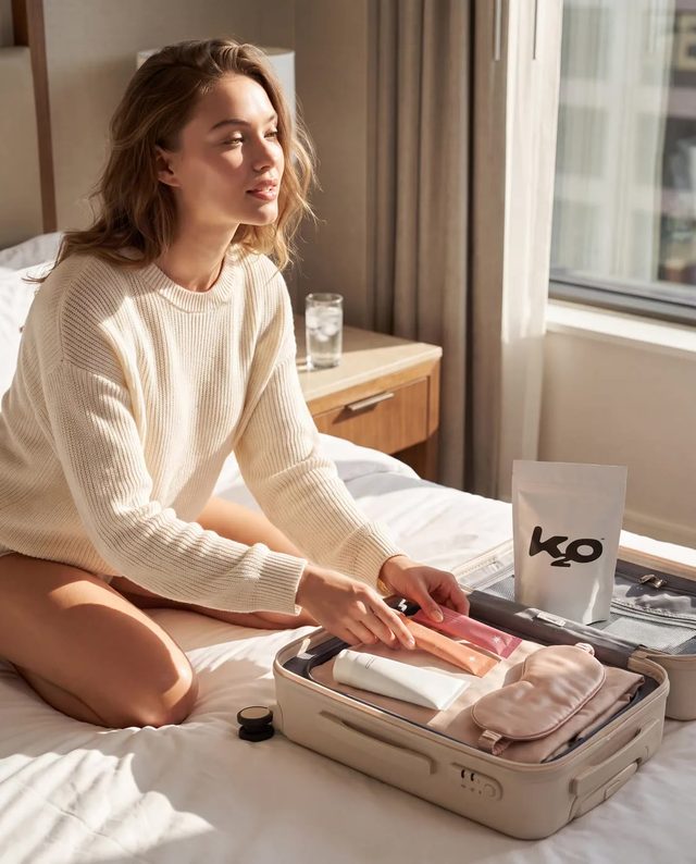
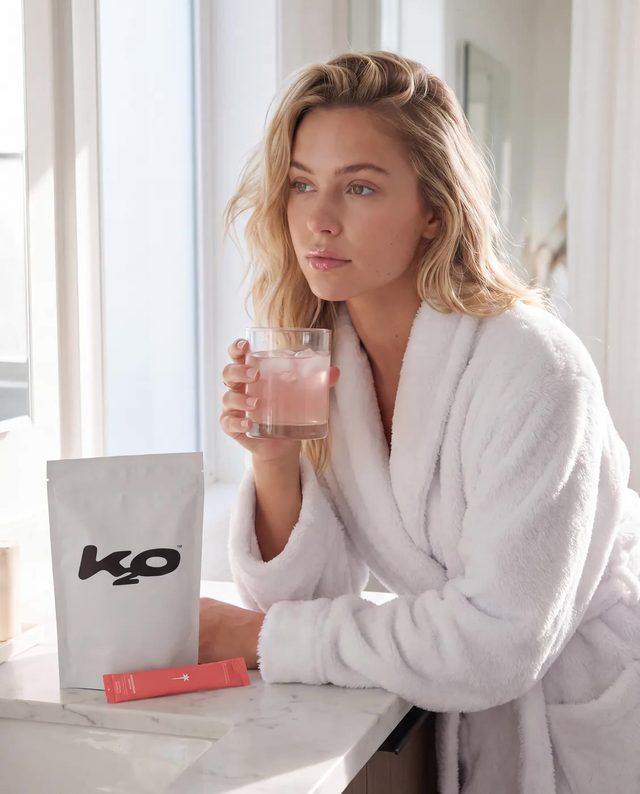
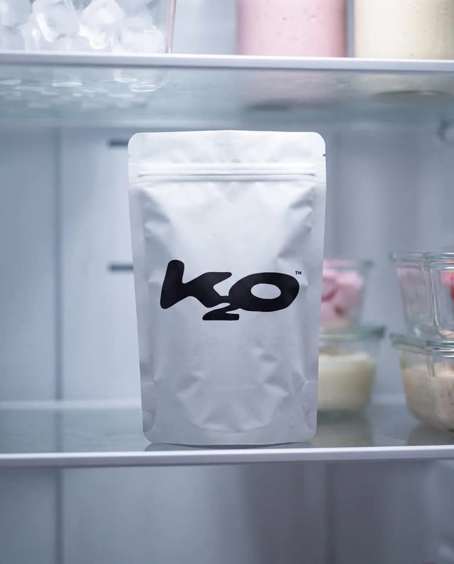
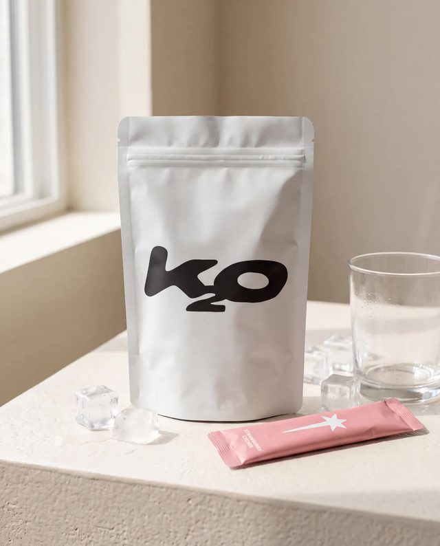
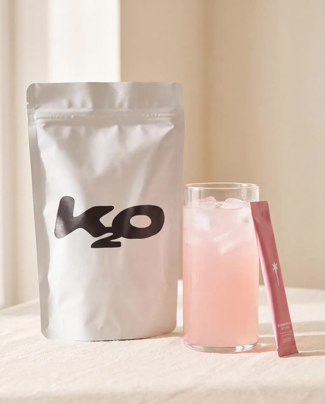
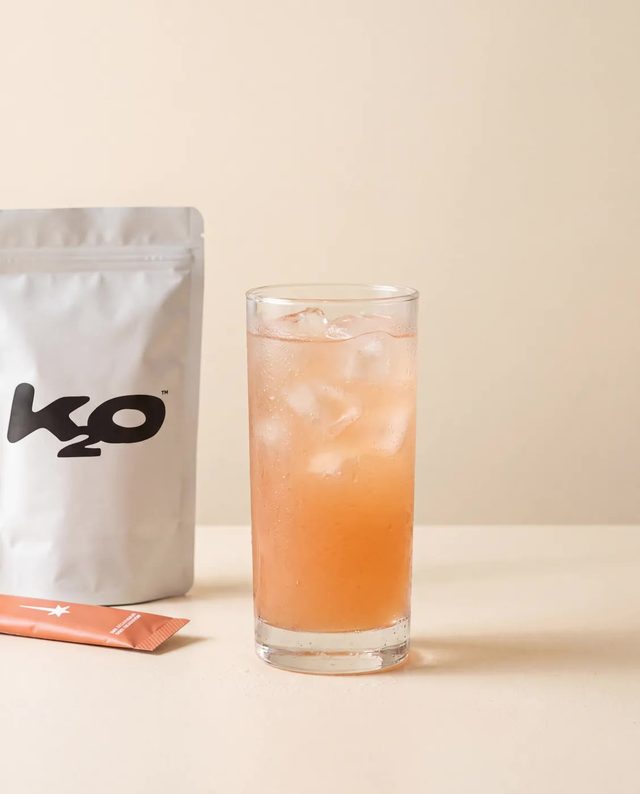
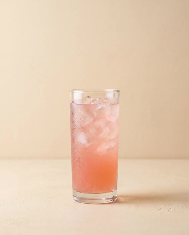
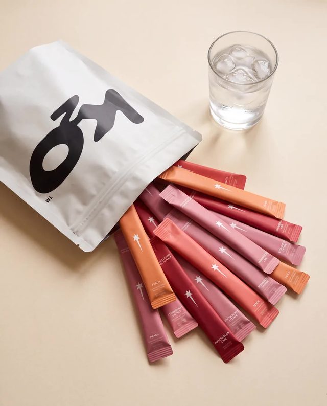
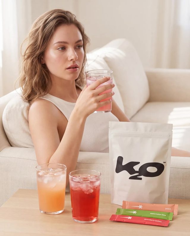
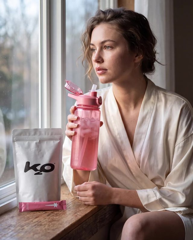
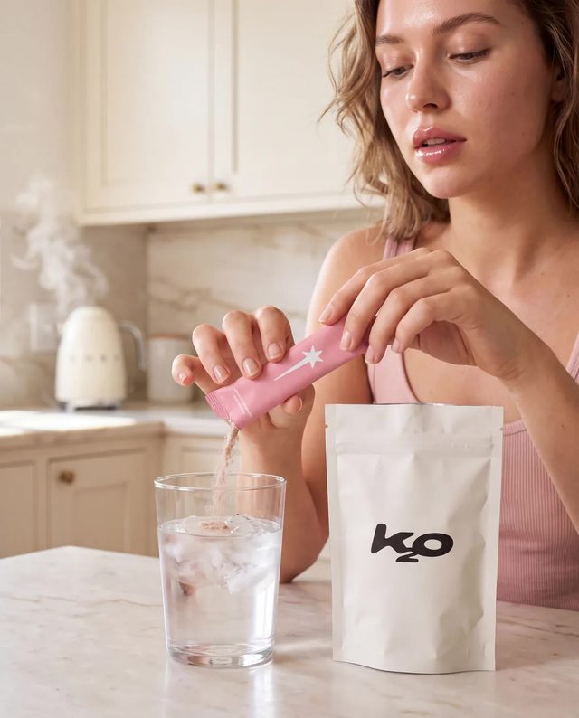
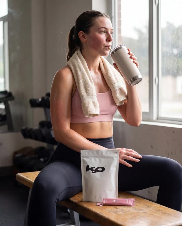
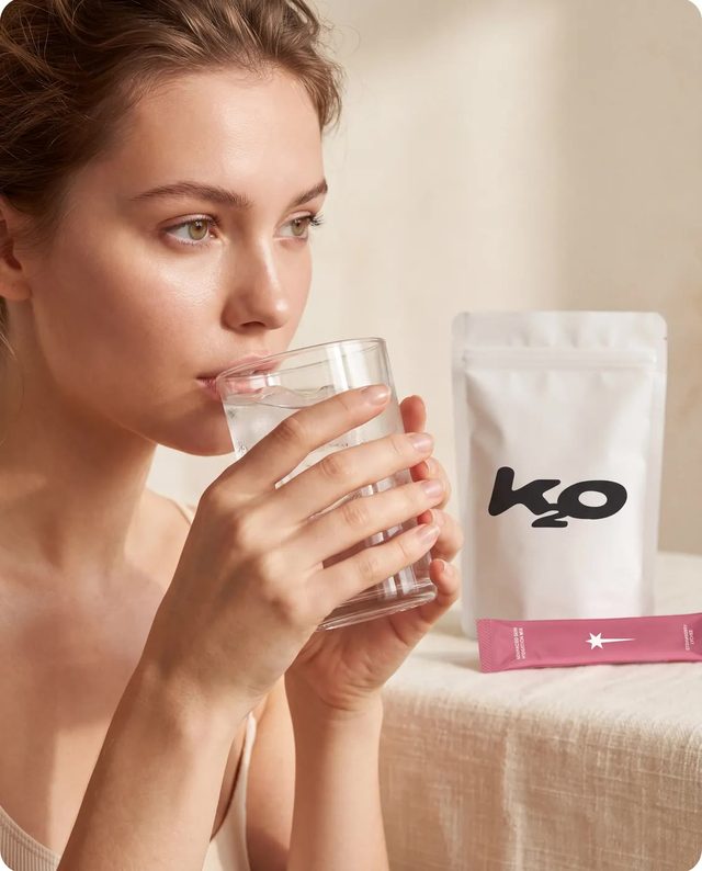
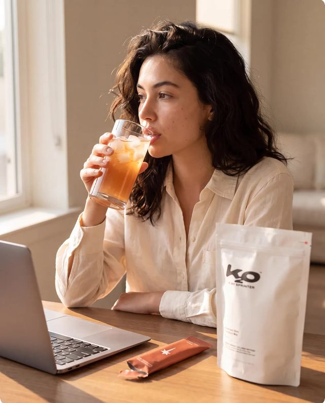
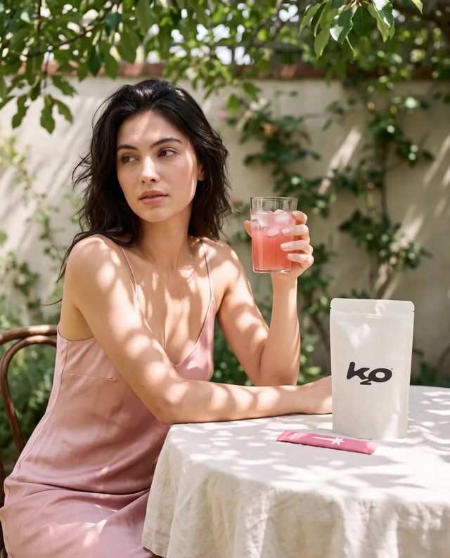
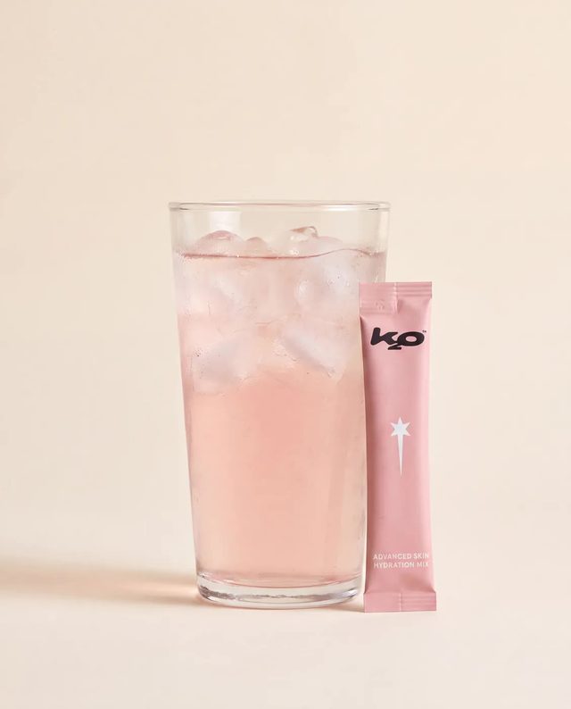
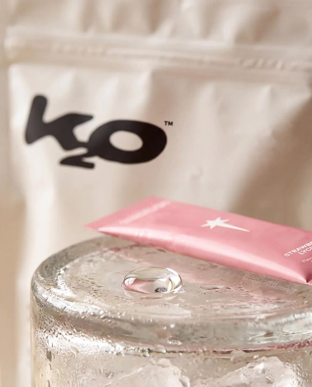
- Product photography of the electrolyte and collagen sachet format, produced for web and feed.
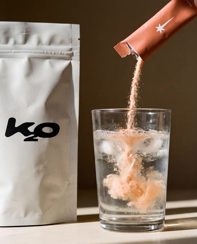
- Launch creative set for the announcement window, product in frame from the opening beat.
- Page, imagery and creative delivered ahead of the launch date.
How It Runs
The Shopify page was scoped as a purchase path, not a website. One page, one action, because a launch audience arriving from a feed has already decided to look and has not yet decided to buy, and every extra route out of the page is a chance to leave. The hero does positioning and product work in the same breath: "built for beauty" says who it is for, "hydration for how you actually live" says when you drink it. Everything below it exists to get to the buy button.
Sachets are hard to photograph. The object is small and mostly packaging, and it lives in a bag rather than on a counter, so the product-on-plinth treatment makes it look like a free sample. We built the imagery to read at the size people actually see it, a thumbnail on a phone, which meant colour and silhouette had to survive being scaled down to the width of a thumb. Detail that only held at full resolution was decoration, so it went.
The launch creative had one hard constraint. It landed in a feed already dominated by the personality attached to the brand, so anything soft or ambiguous reads as more of the same and gets scrolled past. We made it product-first: the sachet is in frame from the opening beat, and the drink is identifiable before a word is read. Borrowed attention arrives once, so the product has to be the part that stays behind after it goes.
Every decision was checked against the first day at volume. That ruled out anything clever that depends on a slow read, and it ruled out page elements we could not stand behind under a spike in traffic. Copy and imagery were built alongside the page rather than handed between stages, so the line in the hero and the opening frame of the launch creative make the same argument in the same words. Nothing on the page needs a second visit to make sense.
Where It Landed
- K2O has a live storefront at drinksprinter.com that does one thing. It explains the format in a sentence and takes the order, so traffic arriving from a post lands on a page built for that arrival.
- There is a product image library that holds up at thumbnail size, which is where the drink actually gets seen. The same shots carry the page and the launch creative without a re-shoot for each placement.
- The creative is product-led, so the sachet is recognisable on its own. That matters past day one, when the brand gets judged on what is in the packet rather than on who introduced it.